Power2Hype
Branding . European Projects

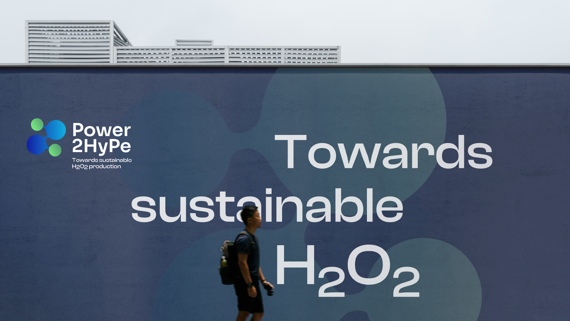
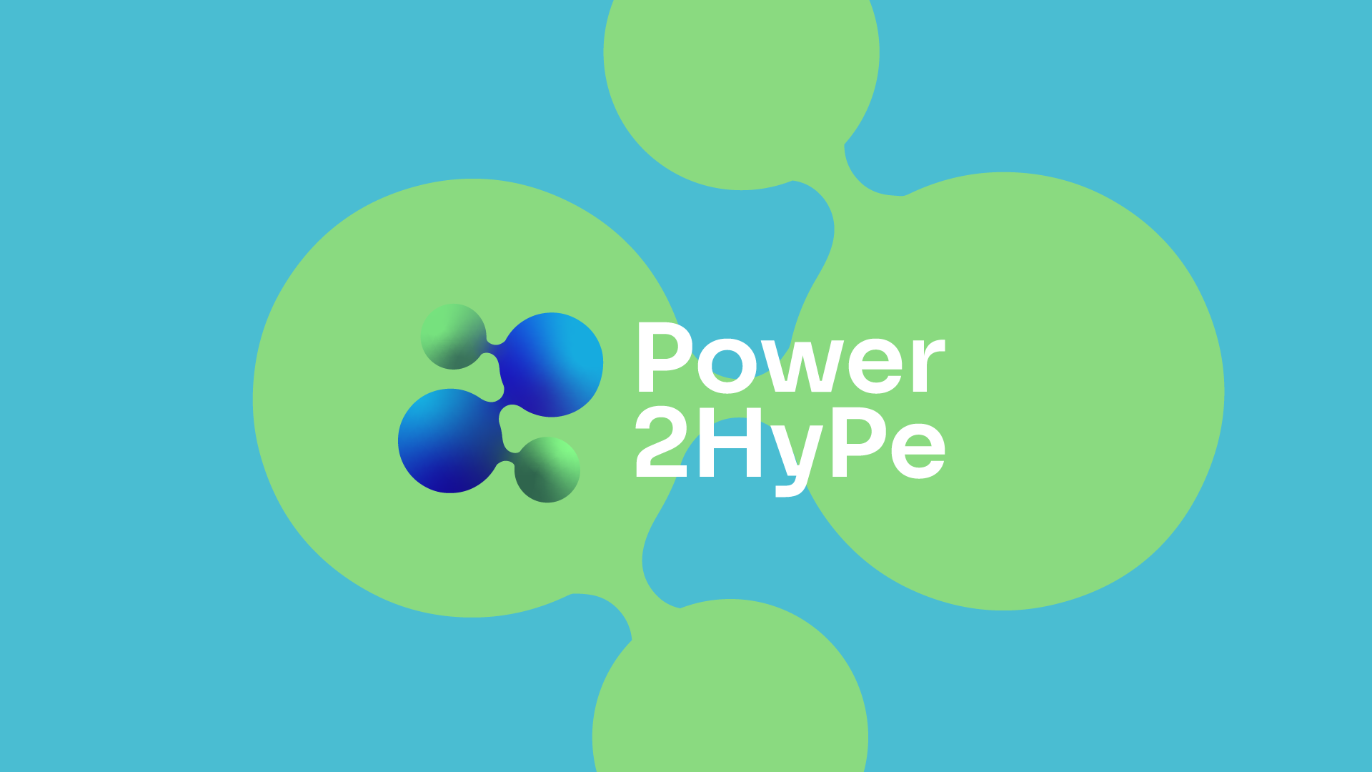
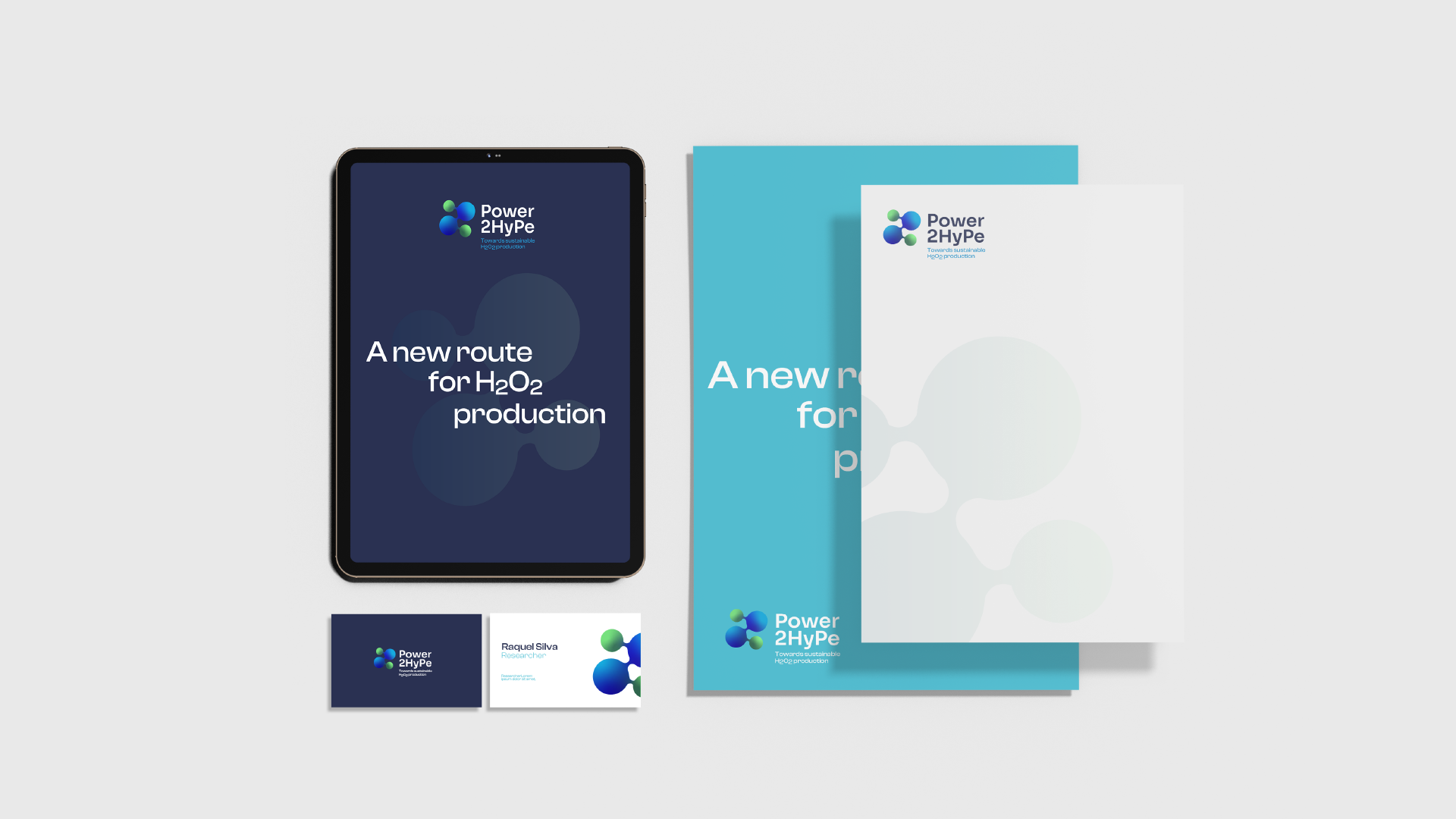
We drew inspiration from the H₂O₂ molecule and the 2HyPe formula, present in the project's name, to create the visual identity. The H₂O₂ molecule was animated to represent the interaction between water, air, and renewable energies.
We opted for a versatile font for the logo, symbolizing the molecule's dynamics in different styles for titles, subtitles, and text.
The chosen colors – dark blue for trust, green for sustainability, and turquoise blue for water and air – reflect the project's essence.
Lastly, we established a brand manual to guide the use of Power2Hype's visual elements.
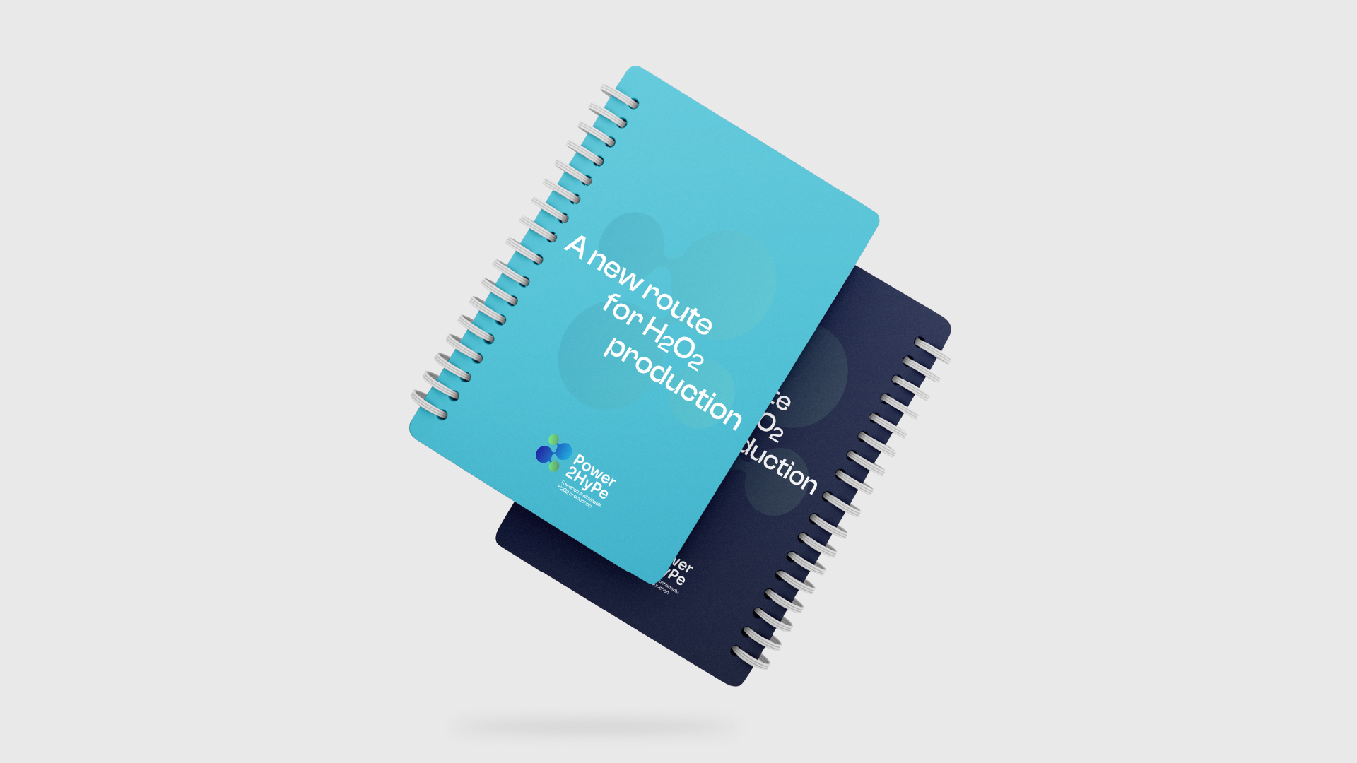
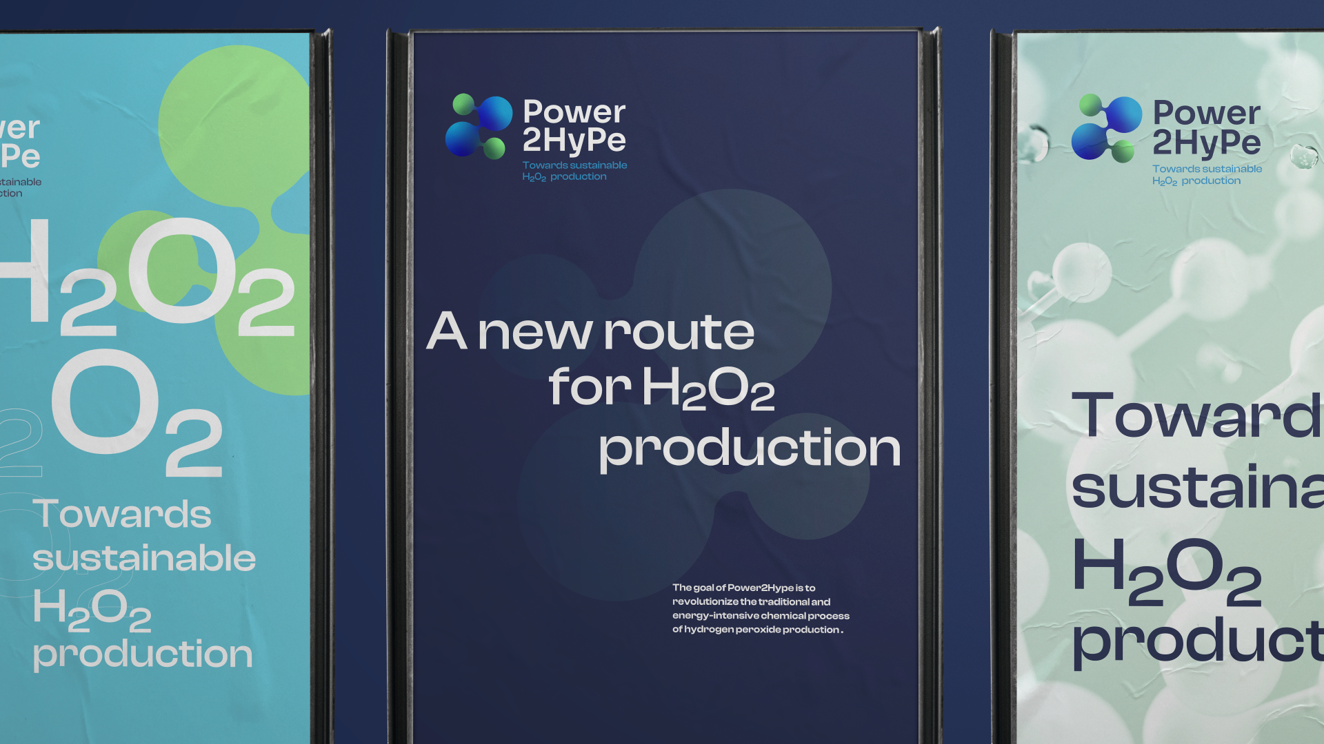
This cohesive visual identity will be applied to various project materials, such as templates, brochures, websites, posters, roll-up banners, and videos.